Taskit
A premium task-based marketplace in MENA where users can get quality services within a few clicks.
Overview
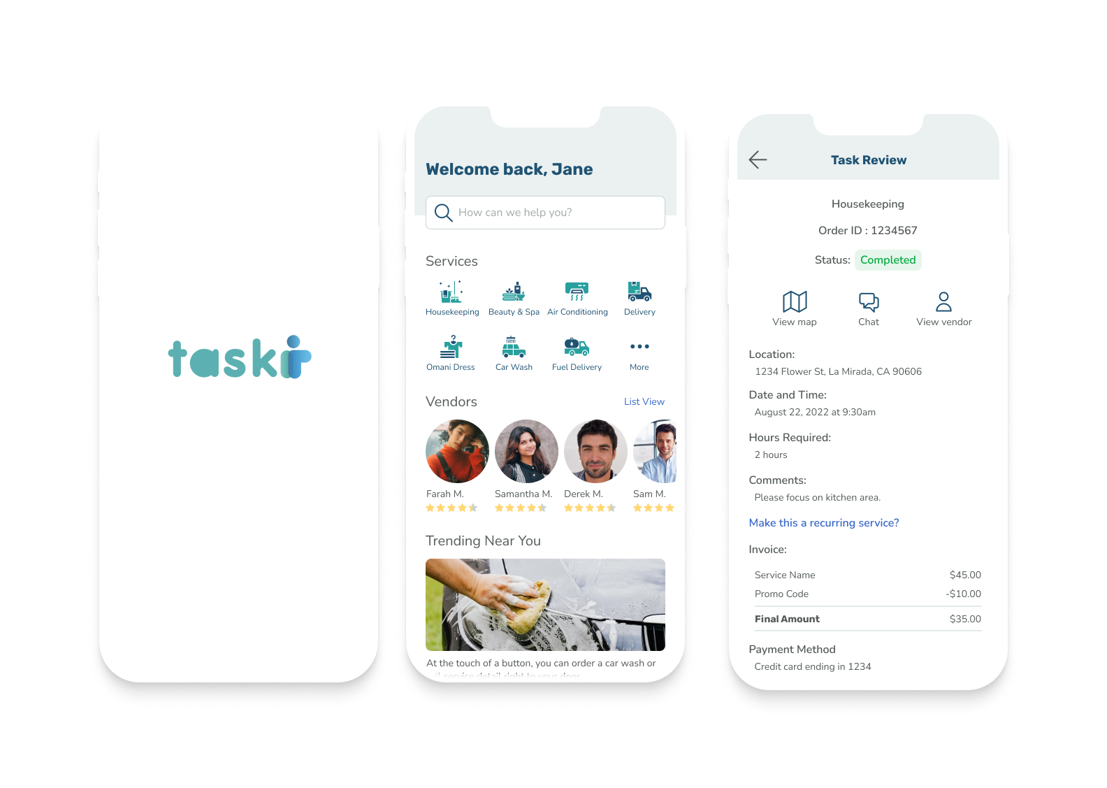
As a working professional it may be difficult to find the time to complete daily errands. Making daily tasks stress inducing. The Taskit app helps connect households with verified service providers in just a few clicks. We worked closely with the owner to redesign the owners existing application.
The Challenge
The client currently wants to improve the user interface for two main areas Vendors/Suppliers app and Customer facing app. He would like us to improve the user flows and functionality of the platform.
The Solution
A simple intuitive platform that is humanized and clear.
Process
Heuristic Evaluation
User Journeys
Wireframes
UI (Hi-Fi)
Style Guide
Role
UI/UX Designer in a team of 5
Duration
7 weeks
Figma
FigJam
Zoom
Tools







Discovery and Research
Kick-off Meeting
My team and I met to discuss the scope of the project. I took this time to ask any clarifying questions to make sure the team and I were on the same page. We made sure to familiarize ourselves with the Taskit app beforehand. We also took this opportunity to discuss client questions.
My team and I devised several questions to ask the client to learn more about Taskit and its functionality. He mentioned that there were two apps; client facing and the service provider app. From these questions, I learned that our client wants to improve the user interface to make it feel humanized and inviting. He also wanted to expand on features adding map functionality to track service providers and the ability to schedule a subscription with the same service provider. These questions allowed me to have a better understanding of the challenge and identify the design process to meet his needs.
Client Questions
Heuristic Evaluation
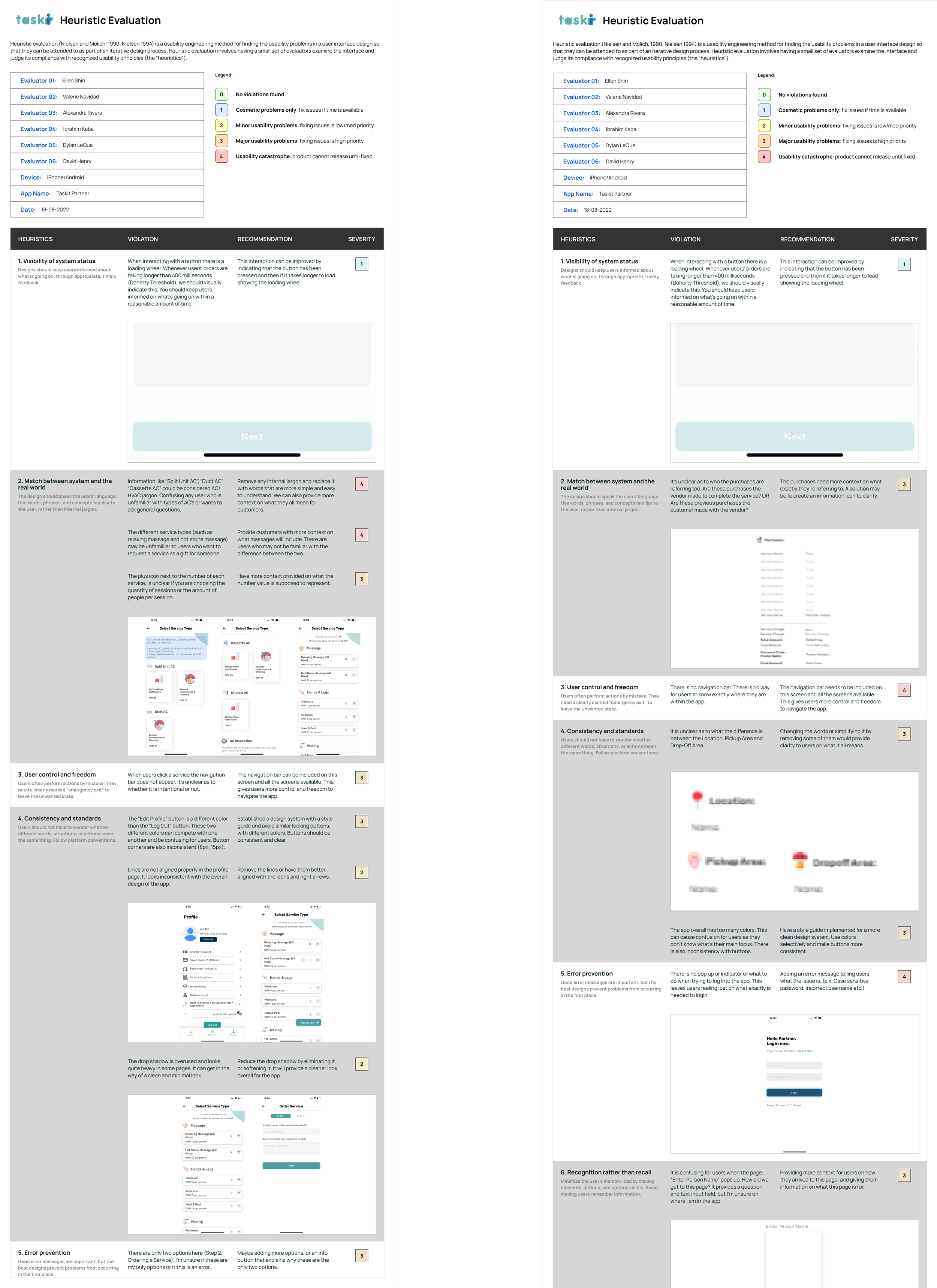
Snippet of heuristic evaluation
Since our client was looking to redesign we took this opportunity to conduct a heuristic evaluation. Because we were working with both the client facing and vendor facing applications we conducted two different evaluations.
I focused on two different principles the Visibility of System Status and Match Between System and Real World. Some of my findings included:
Interactions on current applications can be improved by indicating that the button has been pressed withe the pressed state and then if it takes longer to load showing the loading state with a loading wheel.
Identifying industry jargon when providing explanations of certain services especially in the HVAC repair services
Ideation
User Stories
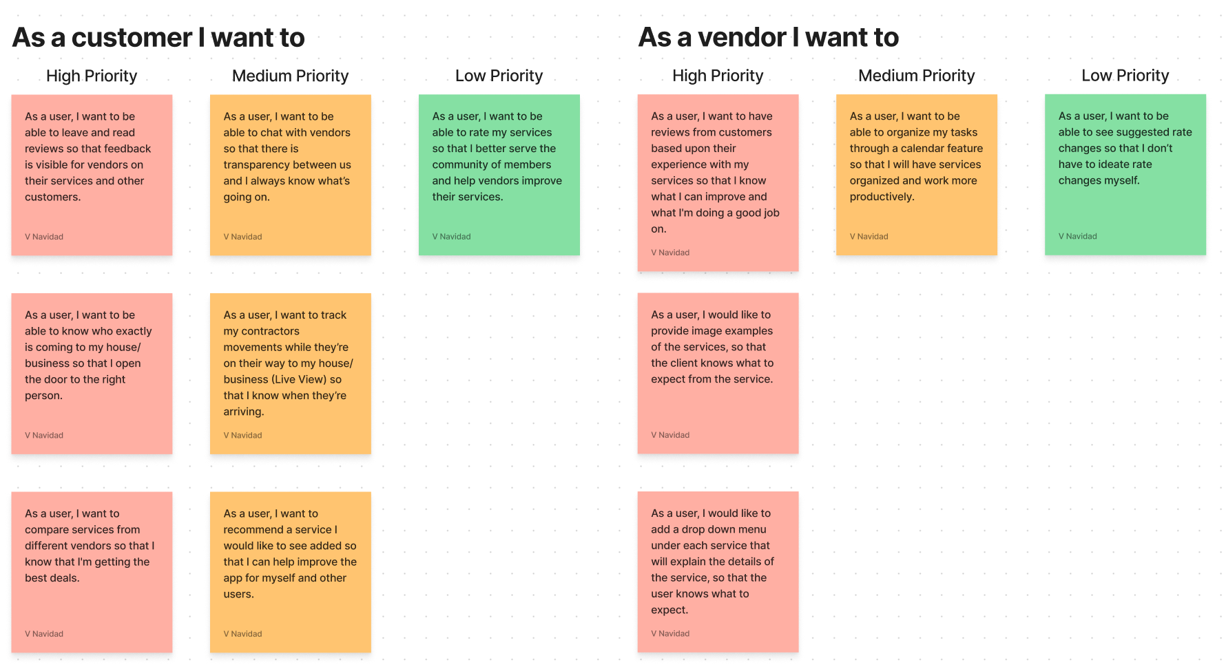
After completing secondary research and competitive analysis to help improve the process of ordering a new task I began ideating user stories from the perspective of the customer and vendor. In order of high medium and low priority we were able to articulate how the addition of new features will provide value to the vendors and customers. We took this opportunity to confirm that we were on the same page as the client and understood the full scope of the project.
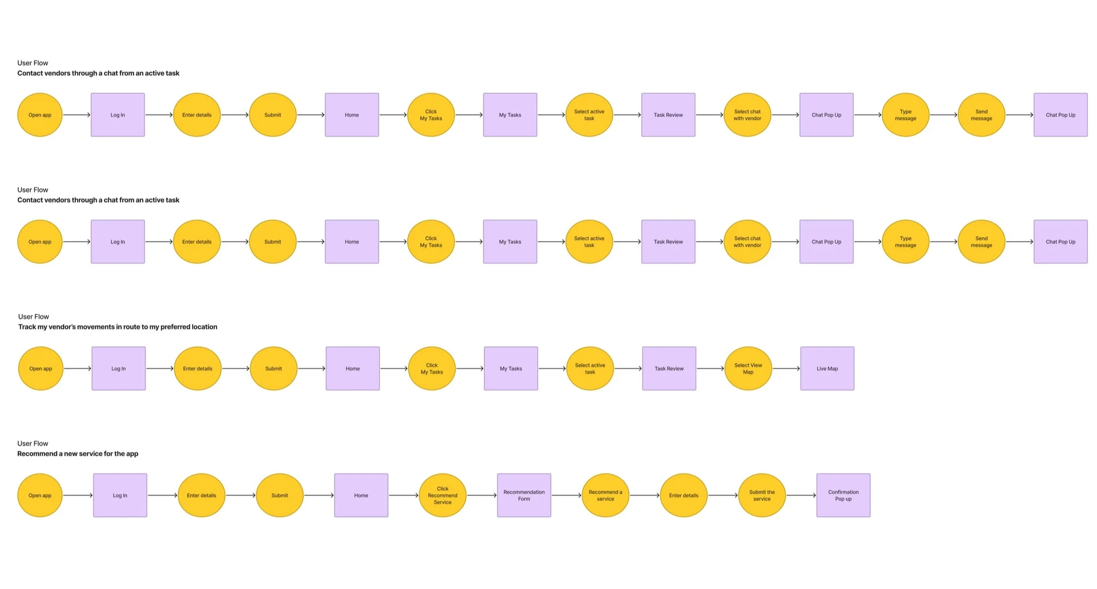
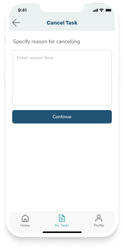
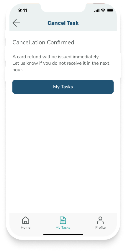
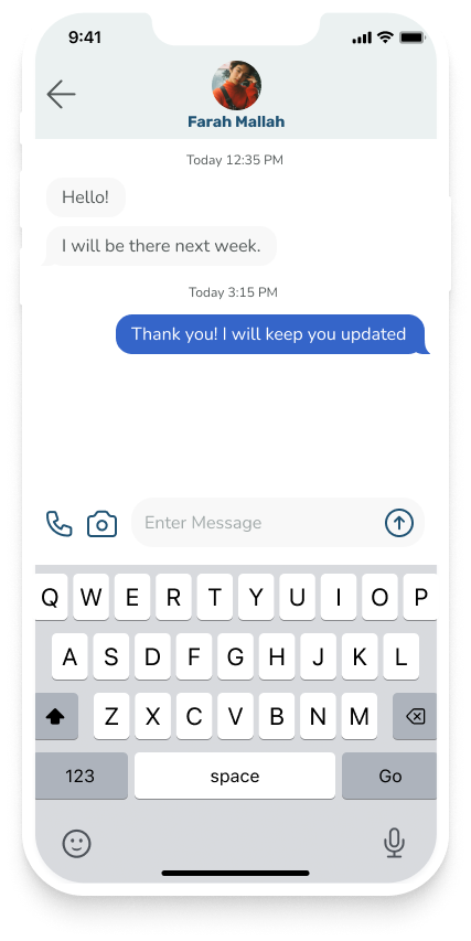
Using the user stories as a catalyst we began to build our user flows. Our team was tasked with different flows my flows included:
Canceling a task and receiving a refund
Contact vendors through a chat from an active task
Track my vendor’s movements in route to my preferred location
Recommend a new service for the app.
When creating these flows I built off of what was already there to prevent any confusion. When introducing new features I looked to competitors such as TaskRabbit and Angi.
User Flows
Wireframes
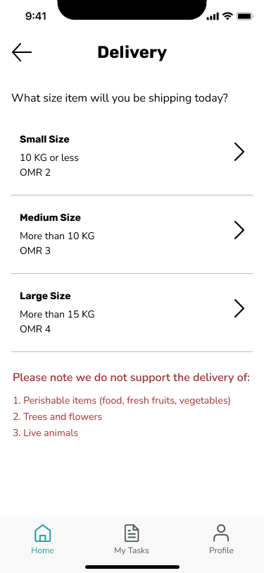
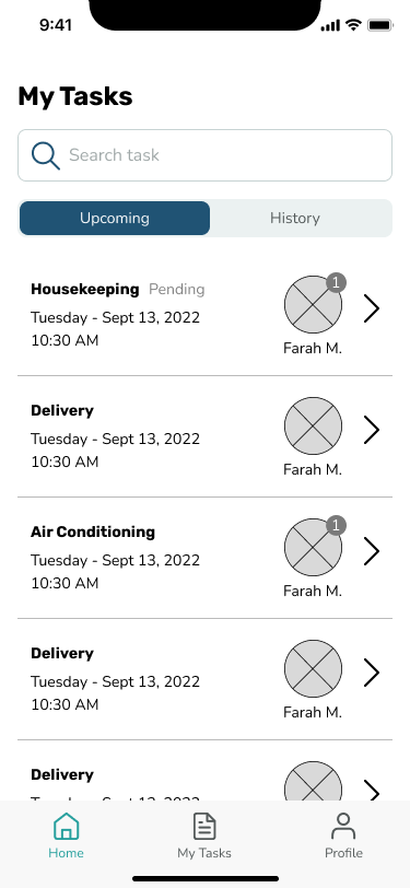
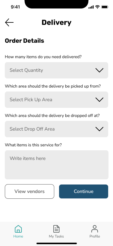
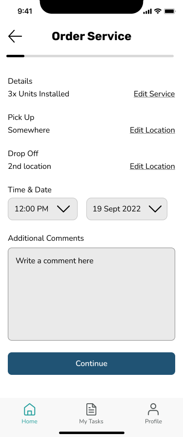
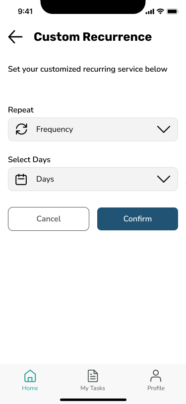
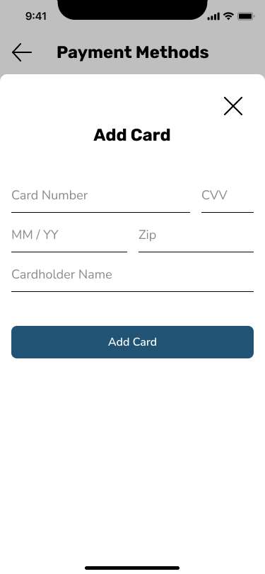
Through our user flows we were able to learn from our client that Vendors could only provide services that they were given access to from the app Admin. In other words the vendor had to go through a vetting system before getting approved for a new role. We kept this in mind when creating our wireframes. When creating wireframes I continued to take inspiration from TaskRabbit and Angi.












Design
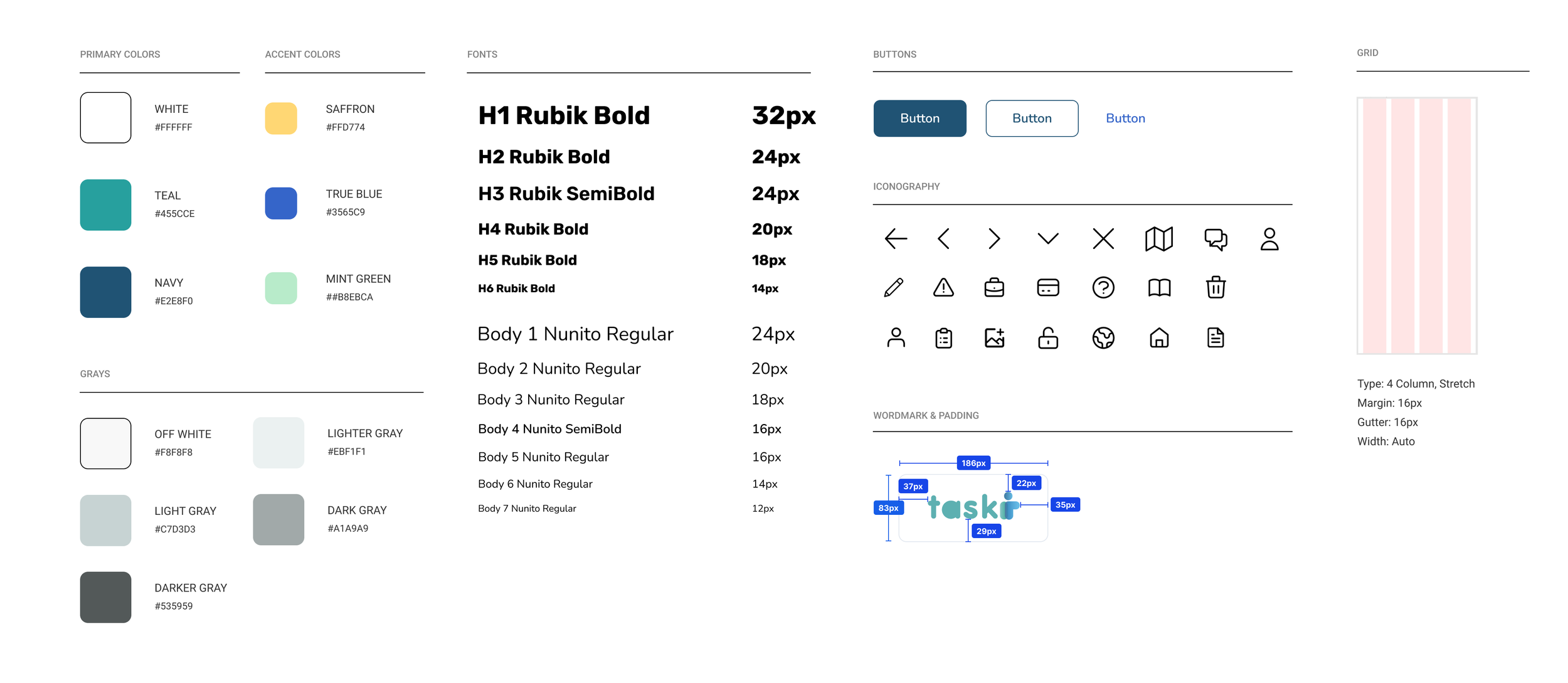
To maintain consistency of colors, fonts sizes, UI elements and grid system the team and I abided by the following style guide.
Style Guide
UI Iterations
UI Iterations
The client shared with us that he really loves the interface of Bumble and Superpeer. I took inspiration from Bumble and Superpeer to create various iterations that feels friendly and inviting. I wanted Backstge to feel more inclusive and stand out compared to other platforms, which is how I created version 4 by implementing more colors through the use of auroras.
High Fidelity
After sharing these iterations with the team, we voted on which iterations would work best for Backstge's brand. I distributed this style throughout our high-fidelity screens. I also created components of the style and features to ensure there was consistency throughout the screens.

